"If, in the business of communications, 'image is king,' the essence of this image, the logo, is the jewel in its crown."-Paul Rand.
Undeniably, Logos hold the power to make or break a brand's identity. They fully represent a company and help turn it into a recognizable brand. It's bewildering how a single piece of graphic design holds the strength to transform any business into a globally acknowledged product.
-
- In-demand trends in logo designs
-
39 Famous Logos and Their Inspirational Stories
- Amazon
- eBay
- Kampgrounds of America
- Olympics
- National Geographic Logo Design
- IBM Iconic Logo
- MasterCard's Famous Logo
- Louis Vuitton
- Formula 1
- Bank of America
- Pepsi
- Apple
- Dell
- Nike
- Coca-Cola
- FedEx
- Rolex
- Subway
- Starbucks
- Walmart
- Red Bull
- World Wildlife Fund
- Royal Bank Of Canada
- Microsoft
- Playboy
- McDonald's
- PIXAR
- Versace
- Baskin Robbins
- Samsung
- Porsche
- Nestle
- Mercedez-Benz
- Adidas
- Walt Disney
- Quicksilver's Female Clothing Line
If we think about it, we are all surrounded by different kinds and varieties of logos. While some of them go easily unnoticed, some we can instantly recognize because of their impact and popularity. The thing that should be considered here is what makes the two of them different. Why can we spot some logos easily?
The simple answer lies in the creation of that logo. The great stories of a brand's foundation combined with the designer's creativity and efforts to fabricate a graphic that captures that essence together make an ostentatious logo design.
Most of the famous logos were not created overnight; rather took a lot of strategic thinking to create an impactful image. They result from big dreams, amazing and inspiring stories, and innovative minds. Integrating all these factors finally builds a logo that grabs everyone's attention because of its peculiarity.
Thus, every logo has a story to tell. It could be the story of the brand's owner or a creative story of the designer's attempt to generate a unique graphic. When looking for inspiration to design a perfect logo, many things come into consideration. The brand's core value, consumer psychology, the message that should be reflected through the brand, and other such aspects vastly contribute to the story behind a brand's logo.
In-demand trends in logo designs
Several big companies use the in-demand trends to design logos that are more attractive to consumers. Popular logo design trends include:
Color considerations
A specific color pattern and combination make a brand logo more appealing to consumers. The most famous are the blue and red colors.
As per data and observations, blue and red are the most sought-after colors many brands use in their logos. Around 35 percent of the famous logos have a blue color, while 30 percent have red.
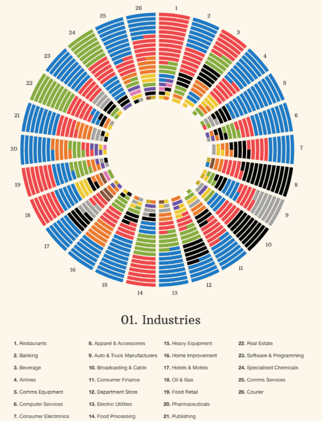
The chart shows various top-notch corporations' use of different colors bifurcated into 26 industries. It clearly indicates the prominence of blue color among brands.
Combination logos
A combination logo refers to combining two different types of logos to create a memorable one. Over 60 percent of famous logos around the world use combination marks. Thus, it is a very popular and trendy choice among top companies.
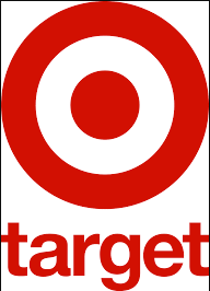
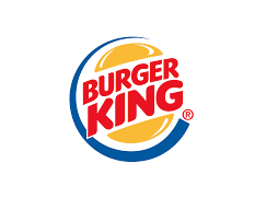
Combination logos can have a mix of a wordmark with a monogram, an abstract mark, or a picture. Famous brands with combination marks include Adidas, Microsoft, Target, and Burger King.
The most famous font
The trendiest logo many famous brands use is the Sans Serif. According to statistics, almost 3/4th of the most famous brand logos have Sans Serif fonts and typefaces. Subway, Chanel, Toyota, Panasonic, etc. Are some examples of brands with Sans Serif font in their logos. Helvetica is another font used widely by several popular brands.
Thus, a perfect logo consists of various stories and attempts. A brand aims to build a logo that sticks in people's minds and helps them instantly remember the products and services. Even though there are numerous brands and logos today that is globally popular and recognized, they did not get famous in the first attempt. Some continued to work and develop with time until they became the influential logo they always dreamt of.
39 Famous Logos and Their Inspirational Stories
Here are some highly engaging, recognized, and famous logos and their inspirational stories and meanings.
Amazon
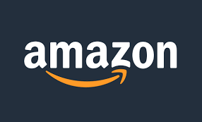
Amazon is the best-known tech company around the globe. But have you ever paid attention to its logo design elements? Initially, the brand was introduced as "Cadabra" but Jeff Bezos (the founder) renamed the brand, and "Amazon" came into existence.
The logo design of this popular brand may look simple, but it has an allusive meaning behind it. A small arrow between "a" and "z" depicts that the brand sells everything. The slight curve makes the logo look like a smiling, dimpled cheek.
eBay
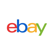
Operating in over 32 countries worldwide, your favorite e-commerce platform was originally named "AuctionWeb." Its creator Pierre Omidyar had also formed a web consulting business called "Echo Bay Technology Group." This is where he got the idea of renaming his multi-million-dollar business.
As the name EchoBay.com was already registered, he chose the second-best name: eBay.com. The brand's logo design was chosen as a gleaming, eye-catching symbol, demonstrating the brand's innovative nature.
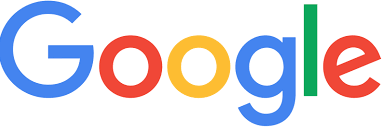
Talking about the company logo, how can any list proceed without mentioning the Google logo design? A well-known brand, Google, was earlier named "BackRub" by the founder Larry Page and Sergey Brin. Later the name "Google" was picked after an employee misspelled the term "Googol."
Ruth Kedar, the original designer of the brand, created the wordmark logo with Baskerville Bold font. With time the logo design was refashioned with sans serif typeface for a more flattering look. As the brand breathes innovation, it came up with changing its logo design on notable days and transforming it into a Google Doodle.
Kampgrounds of America
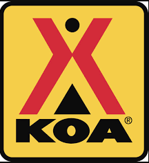
Now turned into one of the most iconic brands throughout the U.S. and Canada arena, KOA (Kampgrounds of America) is the world's biggest family camping provider. Founded in 1962, KOA has more than 525 campgrounds across North America. Its official logo was designed by Karlo Fujiwara in 1961 and remains unchanged.
The straight lines create the letter K, the circle represents O, and the triangle structure depicts A. In addition to that, the yellow and red background also depicts fun and relaxation for campers. If the whole logo design is given a glance, it showcases a tent-like structure that fits in well with KOA's service.
Olympics
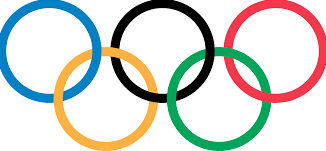
The Olympics is the world's most renowned sports competition, where athletes across different nations compete to make their countries proud. Its logo consists of five rings that are interlaced with each other in equal dimensions. The rings represent the union of five continents through sports and the activeness of the Olympic movement.
Every ring is differently colored, showcasing the color of the flags in each continent. In the background, white is used to show neutrality and peace. Now the question arises, what was the reason behind choosing circles? Well, circles are associated with completeness and eternity providing a more friendly approach.
National Geographic Logo Design
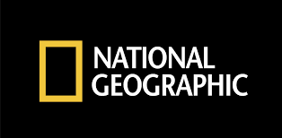
Logo designs are created to leave an everlasting impression of a valuable brand in the eyes of the customers/viewers. The National Geographic logo is designed keeping this very aspect in mind. Chermayeff & Geismar, the proud designers of the logo, created the logo based on the channel's brand identity.
National Geographic started as a magazine, and the logo features a yellow rectangular box representing it. Alongside that, the two wordmarks feature the brand's name in caps. The yellow colors on the logo represent the sun that shines around the globe, just like the channel's global reach.
IBM Iconic Logo
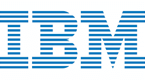
IBM (International Business Machines Corporation) was initially known as the International Time Recording Company (ITR) in 1888. The brand saw several logo variations (various designs and names) before finalizing the current logo.
Designed by Paul Rand, the logo was introduced in 1972. The current logo has IMB written in block letters with stripes of equal width. These stripes represent equality among workers. Interestingly, the reason for choosing such a distinctive design was that no other company used a stripe-based concept, making IBM logo design stand out.
MasterCard's Famous Logo
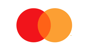
It is hard to miss when famous brands change their name or logo. With Interbank Card Association (ICA), which then switched to Master Charge and ultimately became MasterCard in 1979, every little shift grabbed the public's attention. Along with that, its logo has also seen tremendous shifts.
The MasterCard logo has two design, two circles in red and yellow colors, which symbolizes modernization and optimization. Earlier, the brand name was written beneath the two circles, but in 2019 the name was dropped from the MasterCard logo.
Louis Vuitton
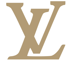
Louis Vuitton Malletier or commonly called Louis Vuitton is a luxury retail company. The company logo was designed by the legendary box-maker and namesake's son Georges Vuitton, who came up with the symbol by putting his father's initials on the canvas. If you look closely, the famous LV logo symbol also represents a Japanese flower.
The idea behind using such a symbol was to prevent the logo from getting counterfeited. But today, the LV logo design has become one of the most prominently imitated logos ever. Its monogram has an L written in italic upper case and is slightly tilted towards the left. The upper case letter V is designed in such a way that it overlaps L.
Formula 1
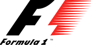
Formula 1, popularly known as F1, is one of the world's most famous auto-racing sports events. It was initially named Formula Internationale, but after giving it some thought it was changed to Formula 1. Its visual identity changed twice.
In 1993, designer Carter Wong created F1's most iconic logos of all time. The design was composed of a slanted "F", and the numeral "1" had speed marks. By 2018, the F1 logo was redesigned. The current logo is written in bright red color. With the letter "F" leaning forward, "1" is formed like a clean diagonal line. Overall the logo gives a simple, minimalistic, yet powerful look.
Bank of America
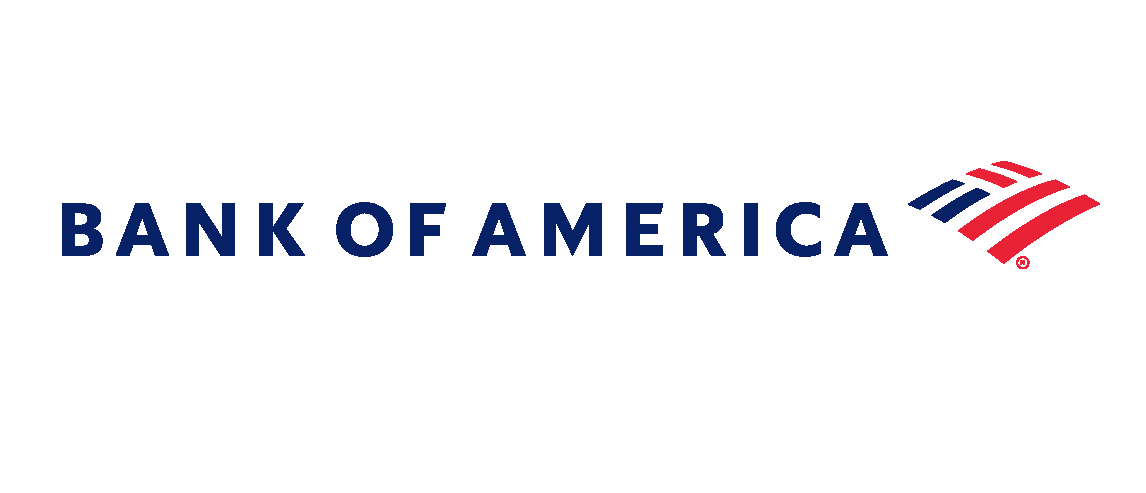
The bank was formed by Amadeo Giannini in 1904 and was named "The Bank of Italy". By 1930, it was renamed "Bank of America", and today it is one of the most prominent financial institutions in the United States. The logo design of this powerful establishment has undergone several major changes.
Finally, after several revisions, a more progressive and elegant logo was introduced in 2018. The logo has the bank's name and a pattern of blue and red stripes on the right giving the whole logo a slight resemblance to the US national flag. Sans-serif font is used to display the name of the bank.
Pepsi
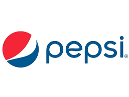
World's famous soda brand, Pepsi, is not just known for its bubbly drink. Its logo design is equally popular, and it can be judged by the fact that it was mistaken for the South Korean flag during the 2018 Olympics. Since 1903, Pepsi's logo has undergone several changes, and finally, in 2014, a unique Pepsi logo came into existence.
Pepsi spent over a million dollars to create the most famous logo of all time. The design has clubbed in various fields of knowledge like Feng Shui, Earth's magnetic field, and gravitation. Ironically, when the logo is turned upside down, it reads "isded", which sounds like "is dead". This gave birth to many memes and YouTube videos, increasing the brand's popularity.
Apple
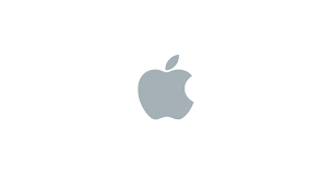
When talking about the most famous logos in the world, you cannot skip the name of the world's celebrated electronic leader, Apple. The simple and minimalistic design has grabbed the attention of people all across the globe. Ronald Wayne, the co-founder, and designer of the original Apple logo, was trying to depict Issac Newton sitting under an apple tree with his design.
In 1998, Rob Janoff redesigned it and replaced the logo with a bitten rainbow apple. The aim of showing a bitten, apple logo was to ensure people didn't confuse it with a cherry. Later on, the rainbow was changed into a more monochromatic style to allow more flexibility.
Dell
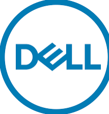
Dell is one of the leading tech companies in the world. It serves around 180 countries and has a staffing power of more than 150,000 workers. At first, the company began working under the name PC limited and traded personal computers from IBM.
By 2003, the company adopted the name Dell Inc and, to date, operates under the parent company name Dell Technologies. Its clean and attractive logo design has been the world's most recognizable logo. For 37 years, the dell logo has been a simple wordmark logo. But after a few years, a slight twist was given to the original idea.
The shape of the whole design is square, and the letter "E" is tilted, giving it a microchip-like look. The tilted "E" projects the unquenched spirit that the company possesses, which made the whole PC industry stand on its toes.
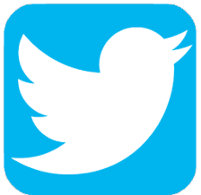
With millions of active users, Twitter has become the biggest social networking site. But have you ever given a thought on what is the significance of the tiny blue bird logo? The Twitter logo first came onto the scene in 2010 and has become a famous symbol since then.
Many Twitter users might not know, but the tiny blue bird also has a name. Inspired by Larry Bird, a legendary basketball player, the logo was named "Larry T Bird". The name was given by Twitter's co-founder Biz Stone, who is the player's biggest fan. Designer Martin Grasser created the illustration for the beats logo by putting 15 circles on top of each other.
Nike
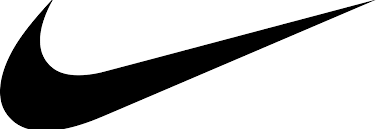
Just by looking at the famous "swoosh" sign, one can recognize "Nike" in an instant. The notable Nike logo was designed by Portland State University graphic design student Carolyn Davidson in 1971. She was paid $35 for creating the most iconic logo of today's modern era.
But don't feel sorry for her; Phil Knight (co-founder) gifted Davidson 500 shares from the Nike stock. In terms of symbolization, the logo depicts the wing of the Greek goddess of victory, named Nike. The design's simplicity makes it a recognizable symbol all across the globe.
Coca-Cola
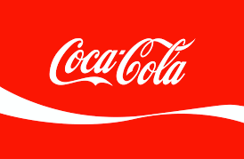
Coca-Cola, a soft drink brand founded in 1886, has the world's most iconic logo. Dr. John Pemberton created the brand's first logo with a simple machine-typed inscription.
Coca-Cola's logo design has evolved truly with time before reaching the final one. The brand logo is fairly consistent and has undergone a few modifications since 1941. The logo design's typography and double 'C' characteristics have changed since 1887.
The brand's logo design looks simplistic, though bolder font and straightened glyphs with bright cherry red wordmarks emphasize the brand's working principle. The Coca-Cola logo fits the timeless brand well.
FedEx
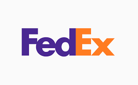
FedEx, a powerful logistics company and courier provider, has a brilliant logo design with a purple-orange color combination. The much-lauded logo has a design trick under its belt.
Looking closely at the logo, you will spot a strategically hidden forward arrow placed cleverly between E and X. The arrow symbolizes the company is always on the move and delivers services with accuracy, speed, and perseverance.
The unconventional colors purple and orange exhibit the qualities of prestige, drive, and success in the services. The artfully placed arrow and purple-orange color combination make the FedEx logo iconic.
The present-day logo design packs a lot without overcrowding and signifies service diversification.
Rolex
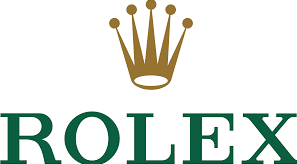
Usually, luxurious brands have a very well-talked-about history related to them, but the case with Rolex is a bit different. The name itself has an unknown back story. Nobody actually knows the true roots of where the term derived. In the case of the logo design, it was first trademarked by Wilsdorf and Davis in 1925.
The original Rolex logo design was a five-pointed crown in gold above the word "Rolex" written in green. It was changed twice. First, in 1965, the crown's color shifted from gold to bronze, and the text was pewter blue. By 2002, the original color scheme came into use.
One of the most successful startups in Silicon Valley, Instagram has been working on redefining its logo ever since its inception. The name Instagram is a portmanteau of two words "instant" and "telegram". Kevin Systrom, the co-founder of the platform, designed its first logo in 2010.
He chose a polaroid camera with a rainbow stripe which showcased the services of Instagram, i.e., photo sharing perfectly. In 2016, the Instagram logo was completely redesigned. Its rainbow stripes were removed, which gave the logo a more modern and refreshing look.
Subway
Combined with fresh and healthy options, Subway is one of the most prominent food chain establishments in the US. Over the years, its logo has been redesigned several times. Initially, the Subway logo had two arrows that came out from the S and Y of the word Subway. The logo remained in place with only a few changes; it was still able to create an impactful overall look.
Subway only used a single color in its logo for a brief period. But with the new design, the logo uses crisp green and yellow colors. The combination conveys two messages to the consumers: positivity and flavor. The two arrows convey the idea of speed and promote the message of movement and motion.
Subway has also created a monogram out of the logo that it actively uses in its marketing strategies.
Starbucks

Have you ever wondered what inspired Starbucks to include the mermaid's image in the logo? The founders chose the brand name of Moby Dick's most sensible character, Starbucks. They searched various marine books to find a mythical creature that could represent the brand and work well as the Starbucks logo.
They chose a Siren as the central character to build a richer brand persona. Lippincott, a design company, rebranded and gave the siren a more human look with a green and white color scheme. The cultural reference in the Starbucks logo holds today's design standards and makes it the most remembered logo among the audience.
Walmart

The iconic Walmart logo is among the most memorable logos in branding history. The simple but effective logo was designed in 1962. The first brand logo was basic and focused on the brand.
But with various iterations through the years, Walmart played with different designs and settled on the final one in 2008. Today, the Walmart logo features lowercase letters besides W and no gap between Wal and Mart.
The font color in the logo design changed to a lighter shade and introduced a new sparkle at the end, similar to the sunshine symbol. The sparkle in the logo represents the key principles of the company.
Red Bull
The most popular energy drink, Red Bull, was created by an Austrian entrepreneur Dietrich Mateschitz in 1987. The brand logo has two red bulls clashing their heads in front of a gold spot with the inscription Red Bull.
Have you ever wondered why there are two bulls with locking horns on the Red Bull can? The two bulls in red color with solid yellow sun symbolize energy, speed, and power. The logo's large and rounded letters immediately catch the audience's attention.
World Wildlife Fund
World Wildlife Fund, also known as WWF, is an organization that helps local communities in navigating a way to conserve natural resources. When the institution began, a giant panda named Chi-Chi arrived at the London Zoo. As the founders of WWF were well aware that they required a symbol that would overcome the language barriers and give the brand a strong image, Panda was an excellent choice.
The original logo was designed in 1961 by the painter, naturalist, and founder Sir Peter Scott. It was redrawn several times until 2000 when the final version of the logo came into being.
Royal Bank Of Canada
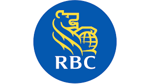
With a long-standing history of 155 years, the Royal Bank of Canada (RBC) was originally named Merchants Bank of Halifax. Established in 1864 in Nova Scotia, RBC has around 15 million clients worldwide. Initially, the brand's logo was in black and white color. But to give it a modern-day look, the logo was revamped in a more modern way.
RBC is written in bold uppercase letters, inspired by the primary badge of the Royal Bank of Canada. The font used in the RBC logo is a modern sans serif typeface with thick and sophisticated lines, which gives the logo a unique look. As for the color scheme, the RBC logo is composed of blue and yellow colors with RBC written in white. The whole look gives a more professional, confident, and energetic look to the logo.
Microsoft
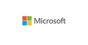
Microsoft was founded in the year 1975 by Bill Gates and Paul Allen. It started as a small project in a garage that later turned into the world's biggest tech company. The first-ever logo design of Microsoft was created by its founders.
Original sans serif font with several concentric lines was used to create the 70s-inspired logo design. After several redesigns, finally, a new and refreshing logo was created in 2012. Segoe UI font has been used to create the modern, minimalistic logo. Apart from this, the four colorful boxes on the left make the design stand out from the rest of the others.
It's not just the logo; the brand has grown exponentially over the past years. It has launched several new versions with improved features that are now more compatible with different VPS servers.
Playboy
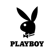
Playboy magazine's famous tuxedoed bunny tops the list of best logos in the history of logo designs. Art Paul designed it for the second issue of the most controversial magazine. The original bunny was sketched in under 10 minutes, and the founder of the infamous brand, Hugh Hefner, loved it.
Since its inception, the logo has neither been tweaked nor taken off the magazine. Sometimes, the logo appears plainly in the magazine, and other times; it is smartly hidden. The color black on the logo represents simplicity, success, and sophistication. The font of the logo depicts PLAYBOY, serif typography with bold and capital letters and written.
McDonald's
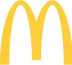
It is not difficult to recognize McDonald's when you see two golden arches lowering down and forming a big "M" figure. The world's largest food-chain company has around 35,000 restaurants in around 120 countries. With a net worth of $39.1 billion, McDonald's has become the ninth wealthiest company.
The first logo design of this well-reputed brand came in the year 1940. With changing times, the business wanted its logo to be simpler to capture the attention of the customers and the brand. In 2003, the brand decided to finally pick golden arches for its logo.
This iconic symbol fits in well with the brand, and to this date, no major changes have been made. Most people don't know that the arches resemble the famous golden brown French fries bent over to make "M". It smartly advertises one of the popular dishes on the menu without any viewer noticing it.
Moreover, the digital expansion of the brand has further popularised it amongst consumers. As the brand uses an authentic VPS server, it has a lightning-fast website and user interface that makes it easier for people to access its services online.
PIXAR
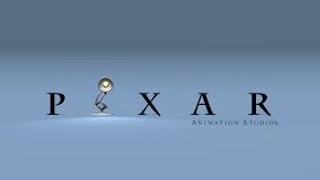
What instantly comes to mind when you see a lamp jumping before a movie commences? Pixar, right? Well, it was not always the same. Pixar started as The Graphics Group and its logo had the studio's name written in sans-serif font with red, black, and white color.
By 1986, Steve Jobs took over the company and changed the business's name to Pixar and the logo design in 1994. Pete Docyer, an employee in the company, changed the look of the Pixar logo and created a brand new design using a serif font style.
Now comes the most interesting element of the Pixar logo: the jumping lamp. Around 1995, Pixar changed the "I" into a lamp and named it Luxo Jr. (the company's mascot and the name of Pixar's first animated movie).
Versace
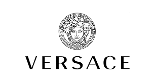
Versace is the biggest haute couture brand all across the globe. Just like the brand's name, its logo too has that royal vibe. The first Versace logo came into existence two years after the brand was launched. It only had the designer's names written close to each other in a sans-serif font.
Later, a new logo design was created to bring some freshness and modernism to the company's branding. If you look closely, the new logo design also contains the head emblem of a famous Greek Mythological creature, the Medusa. Gianni Maria Versace, the proud founder of the fashion brand, used to play in Reggio Calabria during his childhood. This is where he first saw the mythological creature.
As per the legends, Medusa was associated with war and wisdom. One look at her eyes and the person would turn into stone. Gianni used this very inspiration to show the amalgamation of both beauty and destruction tied up together. The brand uses gold, black and white colors to portray power, style, and elegance together.
Baskin Robbins
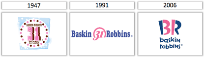
Who hasn't heard of the famous ice cream brand Baskin Robbins? But do you know how it came into existence and its logo's hidden meaning? It all started in 1945 when Irvine Robbins opened his ice cream shop in Glendale, California. His brother-in-law Burt Baskin too opened his ice cream store in Pasadena.
Eventually, they came together and built a brand called "Baskin Robbins". At that time, the brand offered 31 flavors of ice cream, which used to be the rear scenario. The brand wanted to brag about it and planned to include the number in its logo design.
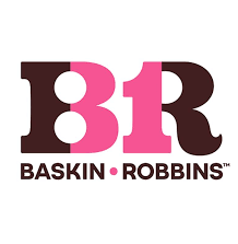
The first logo designed had 31 written at the top of the brand name, and with time, they sandwiched the number 31 into the brand's name in their pink and blue logo. Recently in 2022, Baskin Robbins gave their logo a new makeover by swapping blue with brown color and still maintaining to keep number 31 in it.
Samsung
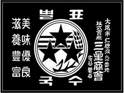
Do you know the ultra-successful tech company, Samsung, was not always into developing electronic products? The brand started as a rice, noodles, and dried fish supplier for neighboring countries, Manchuria and China. Around 1939, they widened their product range from food to wine. While stepping into the 20th century, the company transitioned slowly into electronics.
With the ongoing development, the Samsung logo also saw several changes. During its initial phase, the Samsung logo had three of each stripe, stars, and wheat plants. The connection of these stars was with their name: 'sam' refers to "three" and 'sung' is for "stars". The logo design kept updating as the brand kept changing its niche.
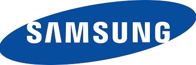
Today, Samsung is known as the world's renowned electronic brand, and with this development, its logo design has also evolved. In a few products, a blue ellipse is used with Samsung written in bold sans serif letters in white. Apart from this, some of its products also use a logo without the ellipse.
Porsche
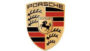
One of the most famous brands, Porsche, is all about class and luxury. Its symbol also reflects the brand's identity and splendor with a traditional approach. If you carefully analyze the logo, it can be separated into four parts. Two diagonal sections with three antlers on each and the other two diagonals with black and red stripes along with the Porsche horse placed in the center.
The iconic Porsche wordmark is printed on the top in sans serif, all capital font. On the top of the Porsche horse, the word "Stuttgart" is inscribed in black and golden outlines. Each element used in the Porsche logo design highlights the brand's value and gives it a regal look. Each iteration that took place over the years is majorly focused on showcasing the timeless beauty of the brand.
Nestle
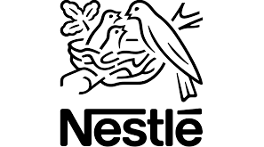
Over the years, Nestle, a multinational Swiss brand, has evolved its identity by manifolds. It is more than just a confectionary company. The brand has transformed into a company that sells almost everything from coffee and cereals to baby food and dairy products. With the brand's evolution, Nestle's logo also underwent a massive transformation.
The brand's name comes from the company's founder, Henri Nestle. In German, the word "Nestle" translates to "The Nest", which inspired the creation of its logo. Since the brand's inception, its logo design has gone through several changes. However, the one thing that has stayed constant all along is the birds and the nest. To this date, the font used in the brand's logo featuring the company name has remained in sans serif typography, which Max Miedinger and Eduard Hoffmann designed.
Mercedez-Benz
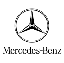
One logo design that is an epitome of class, elegance, and sophistication is Mercedez-Benz, a three-pointed star. The logo came into existence after Gottlieb Daimler sent a postcard to his wife. He was one of the founders of DMG (Daimler Motoren-Gesellschaft), a company that owned Mercedes once.
The postcard was marked with a three-pointed star. After the brand gained success, his sons, Adolf, and Paul Daimler, suggested the star as the logo for the automobile brand. Plenty of changes have been made to the logo design, but the three-pointed star remained predominately the same.
Adidas
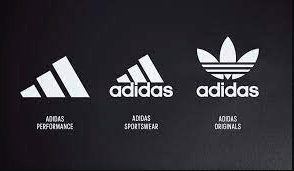
What started as a small family business has now become the world's biggest sports apparel manufacturer; this is the story of Adidas. This world-renowned brand was started by the Dassler brothers, Adolf and Rudolf. In the initial years, the brand had the Dassler name carved on its logo design.
After a few years of remaking the name, Adidas started incorporating it. Since 1967, Adidas has come with different logo designs like the trefoil, the mountain logo, Adidas NEO, and the plain wordmark logo. The brand has pretty much retained all these designs and has been using them for its different product lines.
Interestingly, one thing that has remained constant in all of the Adidas logo designs is the three stripes. Initially, only two stripes were used to make the Adidas shoes. They secured the construction as well as providing a distinctive identity. Adolf Dassler wanted to keep using the trademark, but his family restricted him. So, he decided to add a third stripe. As the three-stripe design was already used by a Finnish sports brand, Karhu, Adolf purchased and trademarked the rights.
Walt Disney
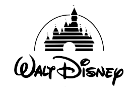
Disney Castle introduced the dreamy logo design of Walt Disney Pictures in 1995. The company logo has an iconic Cinderella castle with the founder's signature. The logo is one of the most recognizable logos designed with a magical touch of calligraphy.
It is believed that the emblem of the Walt Disney Company was hand-drawn by one of the company's employees. Recently, the company has made iterations in the logo design and removed most of the text from the logo. The logo design now retains the word "Disney" in it. The simplistic Disney logo design attracts audiences and helps the company to gain global recognition.
Quicksilver's Female Clothing Line
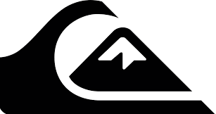
Founded in 1969, Quicksilver is an Australian clothing brand that deals with accessories and shoes for extreme sports like skateboarding, snowboarding, etc. The logo design for the brand was created by the founder Alan Green and, since its inception in 1969, has stayed the same.
Inspired by the Japanese Mt. Fuji, Alan came up with a design that would fit in well with the company's mission and vision. The snow-capped Mt. Fuji mountain, along with the typhoon wave, created a wonderful background that sits well with the surfing product line that the brand deals in.
Logos are more than just a piece of artwork. They are one of the most powerful tools for creating a strong brand identity and capturing the attention of potential customers. If a logo design is as good as stated above, businesses can beat their competition and create a loyal consumer base.
In this article, we have listed some of the world's iconic brand logos with their unmissable backstory in a nutshell. Each of these logo designs had some point of commonality in them. But with the brilliant use of colors and negative space, unique and eye-catching designs were created that helped businesses establish a stronger foot.
Thus, a logo is more powerful than just a mere graphic. It establishes the uniqueness of a brand along with creating its own brand identity among the consumers.
Frequently Asked Questions
What was the very first logo ever made?
Brass Brewery was the first company to trademark the first corporate logo in 1876. The logo had a red triangle with "Brass" written in flowy cursive writing. It resembled the Coca-Cola logo pretty well.
Which logos are best known for getting forged?
Brands with status symbols and a massive customer base are more prone to having their brand logo forged. Gucci, Versace, and Supreme logos are best known to be counterfeited.
What are secondary logos?
A secondary logo is a variation of the primary/main logo design. It is a simplified or stacked version of the primary logo, focusing more on the brand name. The logo's shape can be vertical or horizontal, depending on the nature of your business.
Which is the oldest brand logo that still exists without any alteration?
Popular British tea company Twinnings is known to have the oldest logo that still exists without alteration. The logo design was created over two centuries ago, in 1787. The base of the logo is directly associated with the Twinning family crest, and a few references from China (the source of the tea) are also associated with it. Its simplicity and timeless nature require no alteration of any sort. Thus, the brand has the same logo to date.
What are the 7 Principles of creating a logo design?
Creating a logo design requires more than just skill and talent. There are some set fundamentals that a graphic designer needs to follow for producing a plenary logo design. Here are 7 of its most essential principles:
Simplicity
Memorability
Originality
Modern Yet Timeless
Balance
Complementary
Versatility
What are the 5 types of logo design?
There are plenty of logo design types to help you create a logo. But usually, brands pick up these five types for creating an exceptional logo design:
Word Mark
Combination Mark
Emblem
Letter Mark
Symbol or Icon

Kavita Verma is an experienced content writer with over 10 years of experience in the field. She has worked with several tech companies, including Unisoft Technologies, NIIT, and Infotech, and has written extensively on a variety of technical topics.