Cascading style sheets (CSS) are the backbone of creative web design. One of the most effective ways to elevate your site's visual appeal is adjusting the opacity of a background image — but it's trickier than it sounds. However, there is no direct CSS property that allows you to set only the background image opacity; instead, workarounds using other CSS properties are required. However, there is no direct CSS property that allows you to set only the background image opacity; instead, workarounds using other CSS properties are required.
Whether it’s adjusting colors with RGBA and HSLA or playing with the opacity property and cool pseudo-elements, let’s explore the art of changing background image opacity.
Understanding the basics
CSS is the standard language for controlling the visual presentation of HTML and XML documents. Among its many tools, it gives developers precise control over how a background image looks and behaves on a web page.
The CSS background property is a shorthand that bundles several related properties into a single declaration—color, image, repeat, attachment, and position. When it comes to manipulating background image opacity, the background color property is your primary lever. RGBA colors include an alpha channel, which directly controls transparency, letting you dial in exactly how opaque or transparent a background appears.
How to change a CSS background image's opacity
CSS offers several clever workarounds for controlling background image opacity. Since no single direct property exists for it, designers have developed reliable techniques that get the job done with precision and flexibility.
Here are two of the most effective approaches.
Background blend mode
The CSS background-blend-mode property blends a background color with a background image to simulate transparency. The advantage here is that text and other content remain completely unaffected. You're only manipulating how the background layers interact, giving you clean, independent control over appearance.
Using a separate image element and positioning
Another practical approach involves placing a standalone image element in the markup and positioning it behind your content. By controlling its opacity directly, you can fine-tune how transparent the image appears without touching anything else on the page.
A few things to keep in mind with this method: the content div sits higher in the stacking context than the background image element, and while z-index can help manage layering, it won't solve coverage issues if the image doesn't fully match the element's dimensions. You'll also need to account for background positioning manually. Because there's no built-in equivalent to background-repeat here, precise sizing is essential to avoid cutoff or gaps.
Consider the following example:
< div class="custom-wrap">
    < img class="custom-bg" src="https://images.pexels.com/photos/1037994/pexels-photo-1037994.jpeg" alt="Custom Background">
  < div class="custom-content">
      < h1>Hello Universe!< /h1>
  < /div>
< /div>
Also, consider the following for accompanying styles:
.custom-wrap {
  position: relative;
  overflow: hidden;
}
Here, the main container, custom-wrap
.custom-bg {
  position: absolute;
  top: 0;
  left: 0;
  width: 100%;
  height: 100%;
  object-fit: cover;
  z-index: -1;
}
The custom-bg is set as position: absolute with a subtle opacity. Using z-index: -1 places the background layer behind the content of the container.
.custom-content {
  position: relative;
  z-index: 1;
  padding: 50px;
}
The custom-content
While z-index can refine stacking, limitations arise if the image doesn’t cover element size. Size constraints are crucial to prevent cutoff or insufficient coverage. Additionally, adjustments are needed for precise “background position” and lack of a seamless “background-repeat” alternative.
Output results for the above-styled element:

Overlays with CSS pseudo-elements
A CSS pseudo-element with an RGBA background color can act as a semi-transparent overlay sitting on top of a background image. Because the overlay is a separate layer, its transparency is entirely independent from the content above it. This is one of the most popular methods for achieving a polished, see-through background effect.
<div class="custom-wrap">
 <div class="custom-content">
 <h1>Hello Universe!</h1>
 </div>
</div>
Here's the accompanying style:
.custom-wrap {
 position: relative;
}
.custom-wrap::before {
 content: ' ';
 display: block;
 position: absolute;
 left: 0;
 top: 0;
 width: 100%;
 height: 100%;
 opacity: 0.6;
 background-image: url('https://images.pexels.com/photos/1037994/pexels-photo-1037994.jpeg');
 background-repeat: no-repeat;
 background-position: 50% 0;
 background-size: cover;
}
.custom-content {
 position: relative;
 z-index: 1;
 padding: 50px;
}
The main container, custom-wrap < div>, serves as an absolute positioning container. The pseudo-element: before is configured with position: absolute, a subtle opacity, and background size: cover to fill the entire space. By using a pseudo-element to hold the background image, you can control its opacity independently from the text, achieving a semi-transparent background image effect without affecting the readability of the content.
This method offers flexibility by supporting additional background properties such as background position, background repeat, and background size.
Output results for the above-styled element:

How to set opacity of text, border, and buttons in CSS
Background image opacity is just one piece of the puzzle. Applying transparency to other page elements — text, borders, buttons, overlays — is where designs really start to come alive. CSS box-shadow combined with opacity can add depth and subtle visual weight that improves both aesthetics and usability.
Here's how to apply opacity across different elements.
How to Set Opacity in CSS
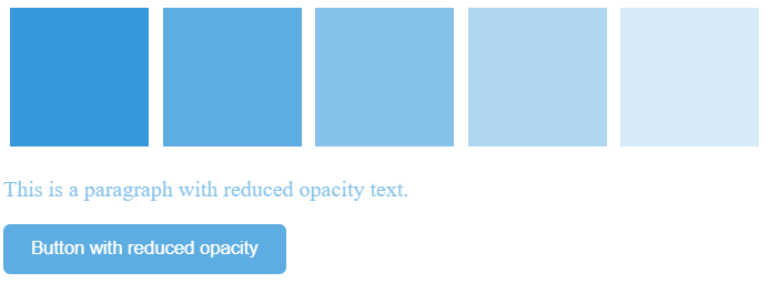
The CSS opacity property controls how transparent an element is, whether that's a background, an image, text, or anything else on the page. Values run from 0 to 1: 1 is fully opaque, 0 is completely invisible, and everything in between gives you a graduated range of transparency to work with.
Take a series of div elements styled with different opacity values. The first renders fully solid, the last disappears entirely, and those in between demonstrate the spectrum. This gives designers a flexible toolkit for building dynamic, layered layouts.
The example below applies this across multiple elements including boxes, text, and a button:
<div class="custom-flex-container">
 <div class="custom-box custom-first"></div>
 <div class="custom-box custom-second"></div>
 <div class="custom-box custom-third"></div>
 <div class="custom-box custom-fourth"></div>
 <div class="custom-box custom-fifth"></div>
 <div class="custom-box custom-sixth"></div>
</div>
<p class="custom-text">This is a paragraph with reduced opacity text.</p>
<button class="custom-btn">Button with reduced opacity</button>
The CSS style for the above elements is defined as:
.custom-flex-container {
 display: flex;
}
.custom-box {
 width: 100px;
 height: 100px;
 margin: 5px;
}
.custom-first {
 background: #3498db;
 opacity: 1;
}
.custom-second {
 background: #3498db;
 opacity: .8;
}
.custom-third {
 background: #3498db;
 opacity: .6;
}
.custom-fourth {
 background: #3498db;
 opacity: .4;
}
.custom-fifth {
 background: #3498db;
 opacity: .2;
}
.custom-sixth {
 background: #3498db;
 opacity: 0;
}
.custom-text {
 opacity: 0.6;
 color: #3498db;
}
.custom-btn {
 background-color: #3498db;
 color: white;
 padding: 10px 20px;
 border: none;
 border-radius: 5px;
 opacity: 0.8;
 cursor: pointer;
}
The output results of all the designs are as follows:
CSS background opacity
You can employ the CSS opacity property to adjust the transparency of an element's background. However, it's essential to note that using this property affects not only the styled element but also its child elements.
Let's consider an example in which we have one div element containing the text inside.
<div class="custom-div">
 <p>Hello World</p>
</div>
If you apply the opacity property to a div containing text, both the div and its text become transparent, which could hinder readability.
.custom-div {
 width: 200px;
 height: 200px;
 background: #3498db;
 opacity: .5;
 padding: 20px;
}
Output results show that opacity also has an impact on the child element, in this case, text.

To address this issue and set the opacity of an element without impacting its child elements, you can utilize the CSS shorthand background property along with RGBA color values. Unlike traditional RGB color codes, RGBA allows you to control both the color and the transparency of an element.
By adding an "a" to the RGB () prefix and specifying a fourth value between 0 and 1, you can finely tune the transparency. A value of 0 indicates complete transparency, while 1 signifies full opacity.
.custom-div {
 width: 200px;
 height: 200px;
 background: rgba(52, 152, 219, 0.5);
 padding: 20px;
}
Output results show that opacity has no impact on the text.

Text opacity CSS
Adjusting text opacity works similarly to adjusting background opacity. The opacity property controls an element's background, text, borders, and more.
When you want to target text transparency alone, though, opacity isn't the right tool. Instead, use the CSS color property with RGBA values. The alpha channel gives you precise control over text without affecting anything else on the element.
A common use case: a lightly transparent paragraph over a solid dark background, where the fade creates visual hierarchy without fully hiding the text.
One important caveat: Be careful how far you push it. Low-contrast text creates real accessibility problems, particularly for users with visual impairments. Any transparency adjustments should stay within the contrast thresholds defined by the Web Content Accessibility Guidelines (WCAG).
Here's an example:
<div class="custom-body">
 <p class="custom-paragraph">This is a paragraph with adjusted text opacity</p>
</div>
These guidelines stipulate a minimum color contrast ratio of 4.5:1 for standard text and 3:1 for more prominent text elements like headings.
.custom-body {
 background: #32467B;
}
.custom-paragraph {
 color: rgba(234, 240, 246, 0.8);
 font-size: 54pt;
 text-align: right;
}
Maintaining sufficient color contrast makes content usable for everyone. WCAG defines large text as anything 18.66px bold or larger, or 24px and above. Getting the balance right between accessibility and aesthetics separates a design that looks good from one that actually works for a wide audience.

Border opacity in CSS
Controlling border opacity follows the same logic as text opacity. If you want to adjust a border's transparency without touching any other element properties, use the CSS border shorthand combined with RGBA color values — the alpha channel does the heavy lifting.
The example below configures a div border to appear black at low opacity, producing a subtle shadow-like effect. It's a small touch, but one that demonstrates how selectively dialing down border transparency can add quiet depth to a design:
<div class="custom-box"></div>
.custom-box {
 width: 300px;
 height: 300px;
 background: #3498db;
 border: 20px solid rgba(2, 1, 0, 0.3);
}
The output shows the border opacity.

Image opacity in CSS
CSS image opacity is most commonly paired with the :hover selector to create interactive effects. Two approaches are standard: a transparent hover effect, where a fully opaque image fades on hover, and a reverse effect, where an image starts partially transparent and snaps to full opacity when the user mouses over it.
The example below loads three images and applies a different opacity behavior to each:
<div class="image-container">
 <img class="custom-image1" src="https://source.unsplash.com/random/300x200" alt="Image 1">
 <img class="custom-image2" src="https://source.unsplash.com/random/300x200" alt="Image 2">
 <img class="custom-image3" src="https://source.unsplash.com/random/300x200" alt="Image 3">
</div>
The first image stays at 30% opacity regardless of interaction. The second drops to 40% transparency only on hover. The third starts at 50% opacity and becomes fully opaque when hovered:
.custom-image1 {
 opacity: 0.3;
}
.custom-image2:hover {
 opacity: 0.4;
}
.custom-image3 {
 opacity: 0.5;
}
.custom-image3:hover {
 opacity: 1.0;
}
.image-container {
 display: flex;
 justify-content: space-between;
 margin-top: 20px;
}
.custom-image1,
.custom-image2,
.custom-image3 {
 max-width: 200px;
 height: auto;
}
Run the code snippet to experience the hover effects in action.

CSS opacity gradient
An opacity gradient transitions a color from fully opaque to fully transparent. In other words, not from one color to another, but from solid to invisible. The opacity property can't achieve this on its own. Instead, use the background property with linear-gradient and RGBA color values, where the alpha channel handles the fade.
The gradient's direction and at least two color stops go inside the linear-gradient() function. Here, the color transitions from fully opaque on the left to completely transparent on the right:
<div id="custom-gradient"></div>
This approach is a flexible way to build subtle, layered transitions, useful anywhere you want color to dissolve cleanly into a background.
#custom-gradient {
 height: 200px;
 background: linear-gradient(to right, rgba(52, 152, 219, 1), rgba(52, 152, 219, 0));
}
The output represents the gradient opacity.

CSS color opacity
Beyond opacity and RGBA, there's a third way to control color transparency in CSS: HSLA. It follows the same structure as RGBA but defines color through Hue, Saturation, Lightness, and an optional alpha value between 0 and 1 for transparency.
Where RGB measures the intensity of red, green, and blue channels, HSL works like this:
- Hue — a degree value from 0 to 360 representing color (0/360 = red, 120 = green, 240 = blue)
- Saturation — 0% is grayscale, 100% is full color
- Lightness — 0% is black, 100% is white
Add a fourth value and you have HSLA, with full control over transparency.
The example below uses two div elements to show the difference:
<div class="custom-flex-container">
 <div class="custom-div1"></div>
 <div class="custom-div2"></div>
</div>
The first div uses HSL without an alpha value — fully opaque by default. The second adds an alpha of 0.6, making it 60% transparent:
.custom-flex-container {
 display: flex;
}
.custom-div1 {
 width: 150px;
 height: 150px;
 background: hsl(188, 100%, 37%);
}
.custom-div2 {
 width: 300px;
 height: 300px;
 background: hsl(188, 100%, 37%, 0.6);
}

Final words
CSS opacity is a deceptively powerful tool. Used well, it adds depth, hierarchy, and polish to a design—whether you're working with backgrounds, text, borders, or images. The techniques covered here, from RGBA and HSLA color models to pseudo-elements and blend modes, give you precise, flexible control over transparency without the blunt-force limitations of the basic opacity property.
Knowing when and how to use opacity is what separates intentional design from decoration. Now you have the tools to choose.
Frequently Asked Questions
Can I change the background image opacity without affecting the text or other content?
Yes. Use a pseudo-element or RGBA overlay instead of the opacity property. Applying rgba() to the background color targets only the background — text and content remain fully unaffected.
How do I brighten a background image using CSS?
Use the CSS brightness() filter. Values below 100% darken the image, values above 100% increase brightness, 0% renders it completely black, and 100% leaves it unchanged.
Does changing background image opacity affect the accessibility of my website?
Yes, it can. Always verify there's sufficient contrast between your background and foreground text. Test against WCAG contrast guidelines, particularly for users with visual impairments.
Can the background color and content within an element have different opacity levels?
Yes. Place the background and content in separate containers and apply opacity settings to each independently.
Can I apply different opacities to multiple background images in the same element?
Yes. Use multiple background images in a single background property declaration, separated by commas, each with its own opacity setting.

Rimsha Ashraf is a technical content writer and software engineer (available on LinkedIn). She has written 1000+ articles and blogs and has completed over 200 projects on various freelancing platforms. She specializes in topics such as cybersecurity, cloud computing, machine learning, artificial intelligence, blockchain, and cryptocurrency.